The Support Center has moved!! See the new website https://support.goalexandria.com/ 

Explore Builder
The root page ALEX:Explore Builder could not be found in space Alexandria.
How helpful was this page?
Related Blog Posts
Blog Posts
-
Your favorite things–Dashboard
created by
Mar 01, 2023
-
Level up your searching
created by
Sep 21, 2022
-
Customize Your Researcher Pane
created by
Oct 16, 2019
-
Genre explore—Search Strings and Explore Panes
created by
Mar 29, 2019
-
Update your Researcher pane!
created by
Mar 15, 2019
-
Sharing is Caring—Share Explore Panes
created by
May 11, 2018
-
Explore Icons—Gotta catch ‘em all
created by
Oct 30, 2017
-
Tell them about it—Explore Messages
created by
Oct 23, 2017
-
New Researcher icons!
created by
Apr 10, 2017
-
Holiday Icons
created by
Nov 30, 2015
Explore Builder
Last Updated: $action.dateFormatter.formatDateTime($content.getLastModificationDate())

Explore Builder
The page ALIB:Wiki Videos was not found -- Please check/update the page name used in the MultiExcerpt-Include macro
Explore Builder Window
The Researcher's Explore interface is fun and attractive—patrons simply click icons to search Alexandria collections or perform other related actions. The following will explain how to use the Explore Builder to create and configure the panes that are used by the Explore interface.
The Explore Builder window consists of two distinct areas:
- The left-hand side of the Explore Builder belongs to the Panes section—which is essentially a list of the default, global, and local panes used to customize the Researcher's Explore interface. Selecting (highlighting) a pane from this list will display the contents of that pane (e.g. the buttons, icons, and actions) in the right-hand side of the window.
- The larger, right-hand portion of the Explore Builder consists of the Explore Pane Buttons/Actions/Icons section where the contents of the selected pane are displayed—in full—allowing you to modify or remove them completely.
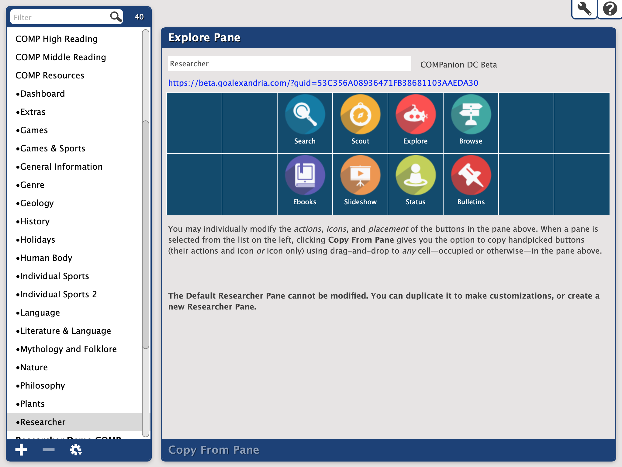
Panes list
The left-hand side of the module contains the Panes List, where all the Explore panes matching your Find criteria will be displayed. This section also contains shortcuts where you can Add or Remove Explore panes.
The default contents of the Panes List will be your local (i.e. user-created) panes in alphabetical order. If there are no panes in the Panes List when Explore Builder is accessed, COMPanion can provide you with the global Explore panes to use as reference or examples; if they appear hidden, select Show Global Panes from the Actions menu.
Selecting (highlighting) a pane from the Panes List will display the contents of that pane (e.g. the buttons, icons, and actions) in the Current Pane section (i.e. the right-hand portion of the Explore Builder).
The control strip situated below the Panes List contains tools that useful for adding, duplicating, importing, exporting, or removing Explore panes.
- Add. Create a new Explore Pane by clicking the Add (“”) button. Provide a name for your new pane (required). The name can be changed later.
- Remove. This selection completely removes the selected pane from the Panes List. This can not be undone, so think twice before making this selection. If you're not sure, you may want to Export the pane first for archive and backup purposes. The default Researcher pane can not be deleted or edited; however you can make a duplicate for which you can.
- Actions. The Actions gear/cog menu contains specific actions and functions unique to the currently selected pane.
- Duplicate Pane. This duplicates the currently selected Explore pane, including all buttons, icons, and actions; duplicated panes are given the same name as the original unless otherwise changed.
- Import Pane. This selection will import an exported pane. A pane can also be imported by dragging and dropping it onto the Panes field.
- Export Pane. This selection instantly queues the currently selected pane to export from Operation Management. Exported panes can later be imported back into Alexandria using the Import Pane selection (above).
- Export All Panes. This selection instantly queues your entire panes database (including Alexandria's global defaults) to export from Operation Management. Exported panes can later be imported back into Alexandria using the Import Pane selection. This is especially useful when configuring the Alexandria Explore interface in a Central or Distributed Catalog; you can create and configure your Explore interface in one location and then share it with others who will adopt your interface via Operation Management.
- Show/Hide Global Panes. The Explore Builder comes loaded with ready-made sample panes that you may adapt to create your very own iconic interfaces. By default, these global Explore panes are hidden, but can be revealed by selecting Show Global Panes. Once active, you may choose to conceal them again by selecting Hide Global Panes.
Explore pane
The Explore Pane comes loaded with clip art-quality icons contained in ready-made sample panes that you can adapt to create your own iconic interfaces; everything you need to customize and configure individualized Explore panes, buttons, icons, and actions. Selecting a pane from the Panes List will populate the Explore Pane section.
What is a pane?
Each Explore pane is a collection of buttons. Each pane can hold a fixed number of buttons in a 8 x 2 grid pattern. Blank or empty buttons act as placeholders for each unused position in the grid. Depending on the Researcher interface you're using (i.e. Search or Explore), you can display up to two Explore panes simultaneously.
What is a button?
Each button in a pane consists of an icon, descriptive label (located below each icon), and associated action that is performed when the button is clicked.
Click a button to select it; once selected, you may change the placement of the button in the pane. Simply click, hold, and drag a button from one location to another. If there's already a button at the destination location, the two buttons will trade places.
When you duplicate or move a button, its attributes are moved along with it.
What is an icon?
An icon is an image or picture used as a visual representation for each button. You can add icons by dragging-and-dropping images directly onto blank (or occupied) buttons—either directly from your operating system desktop or from the Copy From Pane dialog. The Explore Pane accepts most standard image files (e.g. SVG—preferably, GIF, BMP, PNG, JPG). If you're not using scalable vector graphics (i.e. SVG), make sure that your icons have dimensions no larger than 90 pixels wide by 90 pixels high for optimal quality.
What is an action?
An action is the functionality that is performed when a button in the Explore interface is clicked by one of your patrons. These actions can include display messages, opening outside URLs, performing Researcher searches, or linking to other, existing Explore panes.
Explore Pane Settings
The Explore Pane contains the following options:
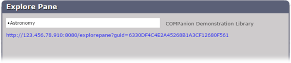
- Pane Name. Provide the Explore pane's name (required). This name is essential when selecting the default Search and Explore starting panes in your Researcher Preferences or when assigning buttons the Go To Pane action. They also appear above the pane in the Explore interface when the pane is displayed. The site that this pane belong appears to the right of the pane name field (e.g. COMPanion Demonstration Library).
- URL. Displayed directly beneath the pane name field, this non-editable URL provides a direct link to the Explore pane in a new browser tab. Use this to preview how panes will look and behave in the Explore interface.
Configuring Explore Buttons
Simply select a button to edit it; this activates the button's Actions section (detailed below).
Actions
- Clear Button. This selection will clear all the actions, text, and images associated with the button and leaves a blank one in its place.
- Clear Icon Only. This will clear the image associated with the button, leaving nothing in its place.
Label. This field allows you to provide a title for the button in any desired language (e.g. Photography). If you enter text in the Label field, it's shown directly below the button image in the pane. Providing a button label is optional, but highly recommended.
Action. Use this drop-down menu to assign the selected button one of the following actions:
- None. A button can be assigned an icon, but the button does nothing.
- Display Message. Allows you to enter a simple message (up to 1000 characters) that is displayed in an Explore interface dialog when the button is clicked by library patrons.
- Open URL. If a valid URL is provided, this action opens an outside website when the button is clicked by library patrons. This is useful if you've cataloged a number of helpful websites for your patrons. If Open in New Browser Tab is checked, URLs will open in a new browser tab when the button is clicked; otherwise, the Explore interface will be replaced with the destination URL. You can also create URL Slideshows. For more on that, go here!
- Perform Search.This selection offers an open search field where user-defined parameters using Alexandria's search strings can be provided; this way, a smart search (default) can be performed with the click of an Explore button. Search is a powerful feature that can be customized through the use of various search strings such as ((NewTitles::%today)) to search for titles that are new today. To learn more go to Search Strings.
- Go To Pane. This selection opens the Select A Pane dialog, which allows you to link to another pane in the Explore interface and create a powerful iconic interface tree. However, you must first create the pane that you want your button to open before you can define the Go To Pane action.
When you have finished editing the buttons for each pane, click Save to keep your changes or Revert to cancel them.
Copy From pane
The bottom of the Explore Pane includes the Copy From Pane option. When clicked,[3] the Copy From Pane slides up, allowing a “secondary” pane to be selected from the Panes List while retaining your “primary” pane up top. When the Copy From Pane drawer is open, it obscures the Actions options (described above).
However, this allows you to copy (via drag-and-drop) hand-picked buttons (including their actions and/or icons) from the bottom Copy From Pane onto blank (or occupied) buttons on the top Explore Pane. Whenever a button is dragged from the Copy From Pane onto an existing button in the “primary” Explore Pane, it is replaced in its entirety.
When you have finished copying buttons from one pane to the next, click Close to collapse the Copy From Pane. Then, you'll be able to individually modify the icons, actions, and the placement of the buttons in the selected Explore Pane. Alexandria will remember and restore the last pane you had selected the next time you use Copy From Pane.
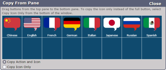
Copy From Pane Settings
Among other things, the Copy From Pane settings allow you to determine whether you'd like to copy the button icon only, or all associated button actions.
- Show Global Panes. When the Copy From Pane is active, the Show Global Panes option becomes available at the bottom of the Panes List. Checking this box shows the default global Explore panes, loaded with clip art-quality icons in ready-made sample panes that are easy to adapt into your own iconic interfaces.
- Copy Action and Icon. If you would like to copy both the icon and all associated button actions, select the Copy Action and Icon radio button at the bottom of the pane before you drag-and-drop.
- Copy Icon Only. If you would like to copy only the icon instead of the full button, select the Copy Icon Only radio button at the bottom of the pane before you drag-and-drop.